Start with what the columns mean
Read the headings without looking at the data. Can you tell whether a column contains a price, quantity, date or comment? Put missing units in the heading or an unambiguous number format. A value of 25 says very little without context: pounds, items and percentages are different kinds of information.
Keep headings short without making them cryptic. Internal abbreviations save space but can exclude a new reader. Where explanation is necessary, place a clear note outside the main data. Avoid repeating long explanations in every row, which makes comparisons harder and widens the worksheet without necessarily making the meaning any clearer.
Display comparable values consistently
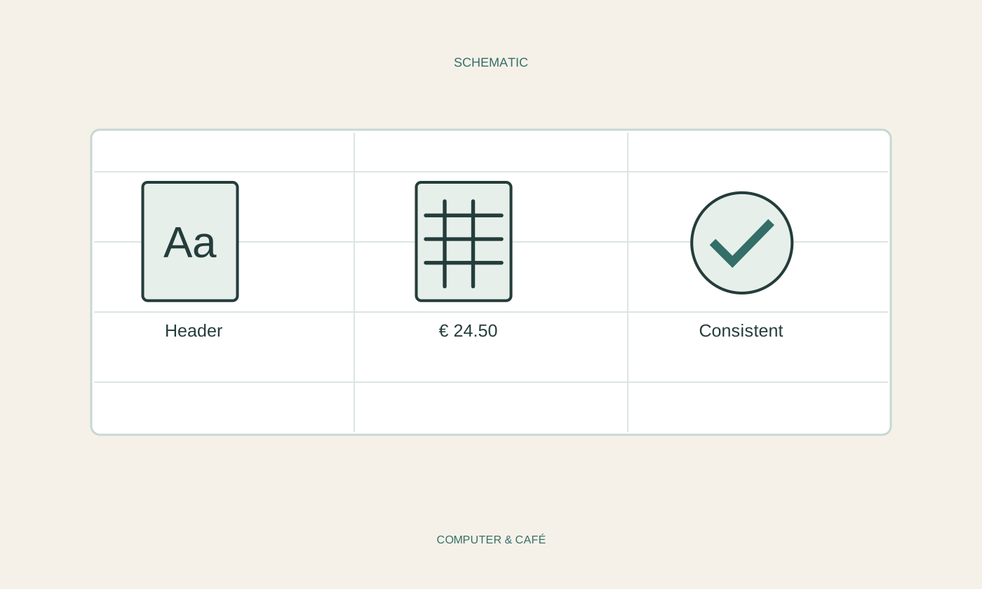
Use the same number of visible decimal places and the same currency format for comparable amounts. Display dates consistently too. These changes initially affect presentation. They do not prove that the underlying values were entered correctly or use the same unit, so investigate conspicuous cells beyond their appearance.
For percentages, try a small check with a known example. Depending on entry and formatting, an intended percentage can be stored differently from what you expect. Inspect the formula or underlying cell content and compare the result. A neatly formatted incorrect ratio can be more misleading than an obviously unfinished entry because the presentation makes it look authoritative.
Use space before adding decoration
Adjust widths so that important values remain fully visible. Text wrapping may suit long descriptions better than an extremely wide column. Check row heights afterwards. A note cut off at the bottom of a cell remains unreadable even when wrapping has technically been enabled.
Use colour sparingly, perhaps for a header row or clearly identified input cells. Colour should not carry an essential meaning by itself. Label an outstanding item with a word as well as a red background. Avoid covering everything in heavy gridlines when a few separators and a quiet background already make the groups understandable. The emphasis should guide attention towards the data.
Protect relationships when sorting
An attractive table still needs to behave reliably during editing. Keep related information in complete rows and avoid decorative blank rows within the data range. Merged cells can complicate later sorting and filtering, so do not make them the default solution for every heading or repeated category.
Before sorting, inspect the selected range. Names, dates and amounts must move together. Check a few familiar rows afterwards. The overall sum can remain unchanged even when values have become associated with the wrong descriptions, so a correct-looking total would not reveal that mistake. Content checks remain necessary even when the layout and arithmetic both appear convincing.
Inspect the form people will actually receive
Review the spreadsheet in the format in which it will be used. A large desktop screen, a PDF and a printout impose different space limits. In print preview, check repeated headings and make sure a lone column has not spilled onto another page. Do not shrink everything until the numbers become difficult to read merely to force a one-page result.
Open an exported report again and read one typical row all the way across, comparing label, unit and value. If this requires constant jumping between pages, change the arrangement or selected scope. Readability comes from a clear route through the information, rather than an abundance of colours or the smallest font you can fit into the available space.
Use clear units, consistent numbers and suitable spacing, while still checking values and complete rows.