Clarify the actual viewing situation
Consider whether the presentation will appear on a large display, through screen sharing or as a file people read independently. These situations differ substantially. A slide that looks clear close up on your laptop may be difficult to read in a reduced meeting window. Where possible, test the eventual viewing arrangement rather than relying solely on the editing interface.
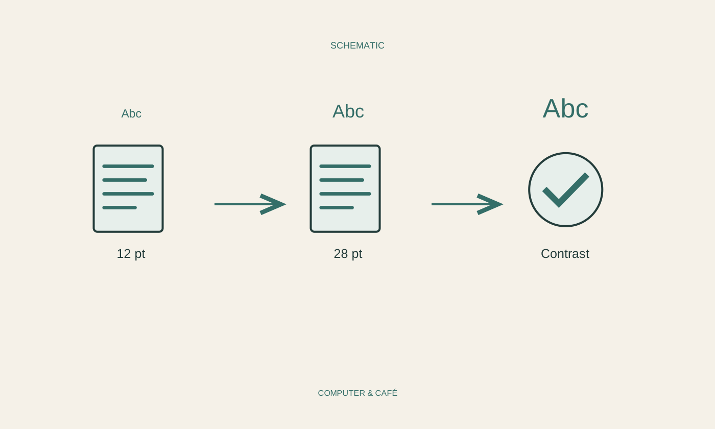
Choose several dense slides for a trial: a table, an illustration and a page containing longer statements. Look at them without the explanatory context you already know. Ask which point becomes apparent first and whether the necessary details remain readable. One particular font size cannot guarantee clarity. Distance, available area, typeface and content need to be considered together before changing the whole file.
Organise ideas instead of shrinking all text
Check the central point of each slide. If several unrelated ideas compete for attention, separate them where appropriate or remove unnecessary detail. Do not automatically reduce all the text merely to fit one more paragraph. An additional purposeful slide can be clearer than one overcrowded surface, particularly when the audience must listen and read at the same time.
Use informative headings and a logical visual sequence. Keep related elements together and check that illustrations genuinely support the point. For digital accessibility, meaningful alternative text and an appropriate reading order can matter. Use the functions provided by the presentation application. A decoratively positioned text box is not automatically placed where assistive technology would read it in a sensible sequence.
Check contrast and illustrations in practice
Look for a clear distinction between text and background. Include labels inside charts and text placed over photographs in this review. A colour that looks distinct on your display may be less recognisable in another setting. Do not use colour as the only way to convey an important difference; add suitable labels or another understandable distinguishing feature.
Inspect enlarged illustrations for detail. A small screenshot does not automatically become readable when stretched across the slide. Remove unnecessary areas or use a clearer original representation without misrepresenting relevant information. Table headings and units should remain identifiable. An attractive graphic can still conceal the intended point, especially when its labels require more effort to interpret than the information itself warrants.
Review the presentation and its export
Run the full presentation in its intended order. Check transitions, embedded media, notes and any private material outside the slides themselves. Use available accessibility checks as additional help, without treating their result as proof that the presentation is completely understandable. Brief feedback from another person can reveal confusing details that have become invisible to you through familiarity.
If sending a PDF or another exported version, reopen that result and check every page. Inspect sequence, clipped elements and readable labels. Export does not preserve every interactive or structural property unchanged. Name the final version clearly and retain the editable source. The review ends with what is actually shown or sent, rather than with the successful saving of the original file.
Test the presentation from the audience’s perspective and check any exported version again.